Bart BioHof
Objective:
To create a distinctive, organic, and visually appealing brand identity for Bart BioHof, a leading German agricultural company that emphasizes sustainability and offers a variety of products, including eggs from mobile chicken coops, pasta, milk, and more.
Challenge:
The agricultural market is saturated with various brands, many of which claim organic and sustainable practices. Bart BioHof needed a brand image that would not only stand out in a crowded marketplace but also genuinely represent their values and product range, capturing the essence of their organic approach and commitment to quality.
Solution:
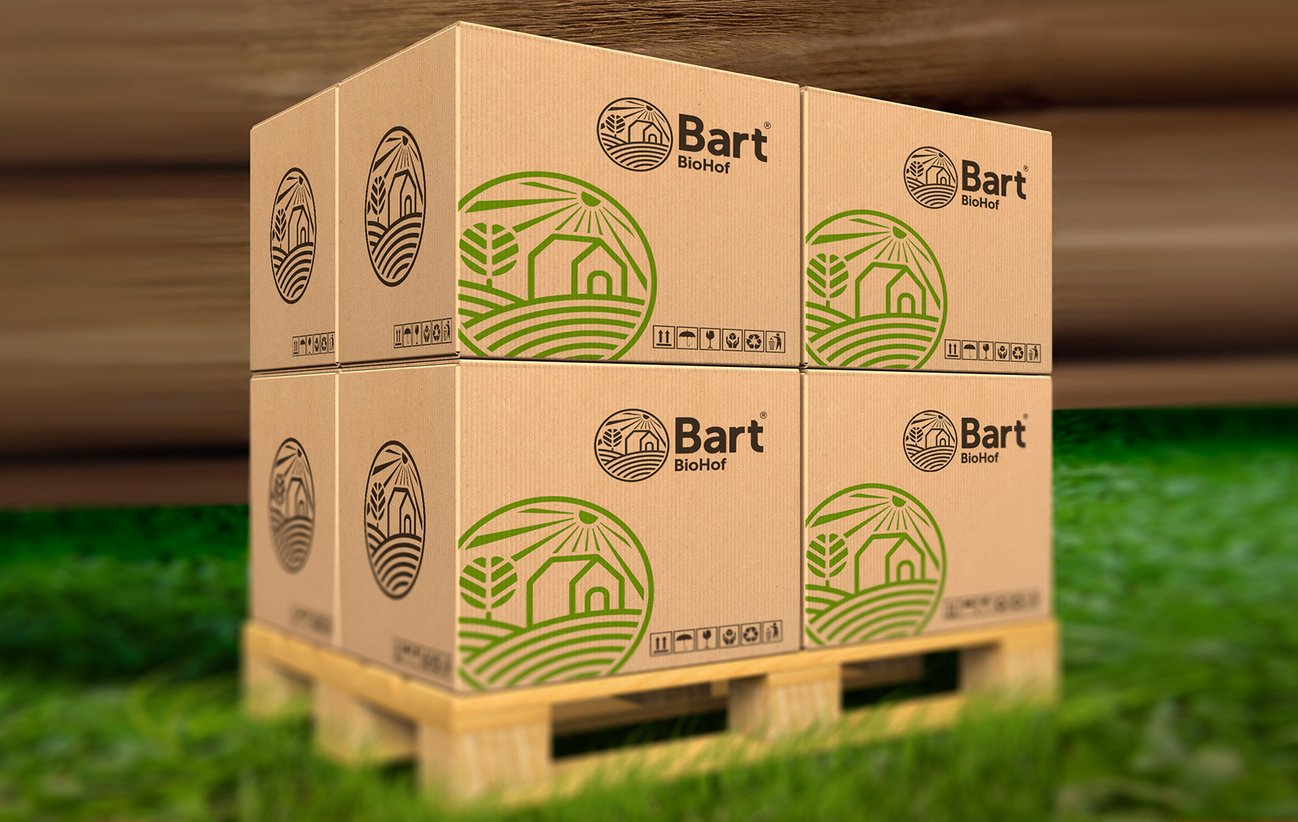
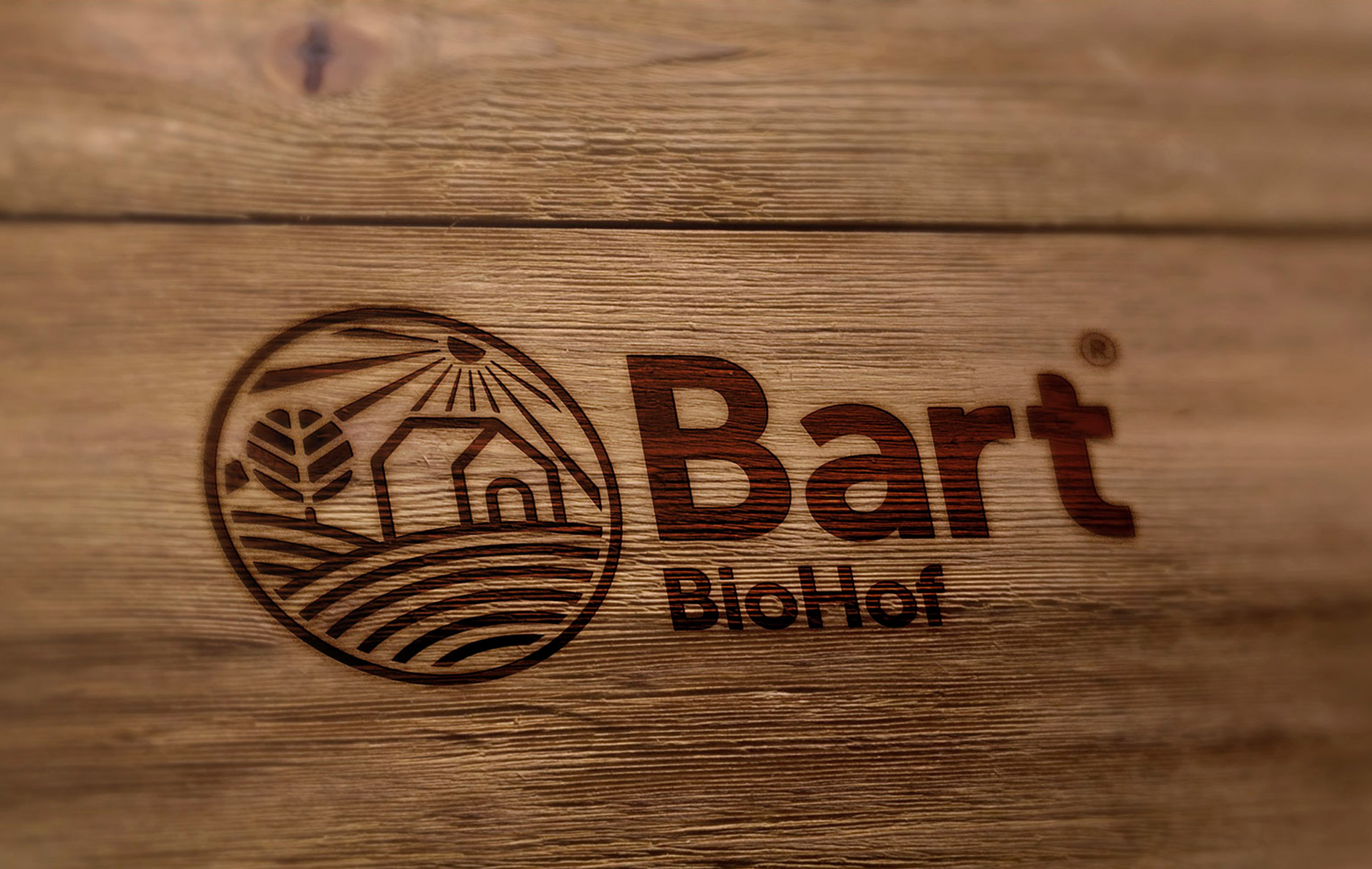
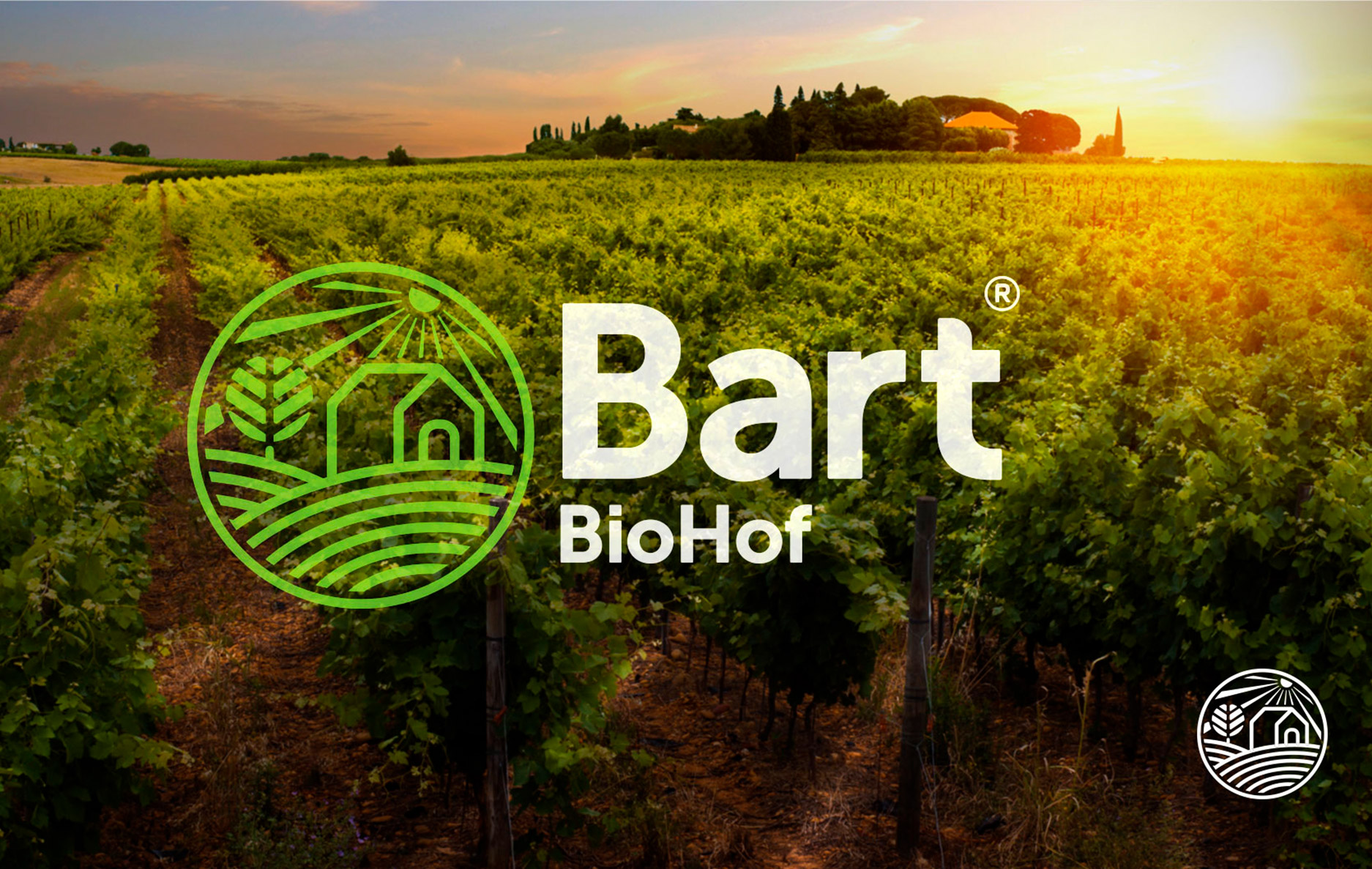
As a seasoned graphic designer and art director, Romero Melo embarked on a comprehensive design journey, starting with a deep dive into Bart BioHof’s ethos and practices. Drawing inspiration from the natural landscapes of German farmlands and the organic nature of the products, a logo was crafted, depicting a harmonious blend of farmland, sunrise, and crops. The rustic yet modern wooden background gives a nod to both tradition and innovation. The consistent color palette and imagery used across the different product packages create a cohesive brand experience, emphasizing the natural and organic essence of the company.
Result:
The redesigned brand identity resonated deeply with the target audience, leading to increased brand recognition and product sales. The logo and accompanying designs became synonymous with quality, sustainability, and organic authenticity. Bart BioHof reported positive feedback from both new and returning customers, highlighting the designs’ visual appeal and alignment with the brand’s core values.
Client: Bart BioHof – A German agricultural company that champions organic practices and offers a diverse range of high-quality products.
Designed by Romero Melo


