Ataski
Project Defense: Ataski – Visual Identity for German Kids School
Objective:
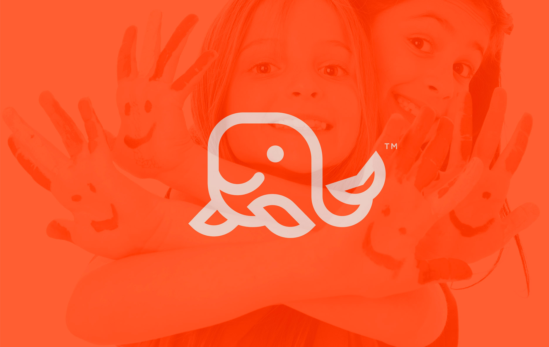
Our primary objective was to craft a distinctive and memorable visual identity for a German kids school, encapsulating both the joy of childhood and the academic rigor that a school signifies. The school’s management required a symbol that resonated with the playful yet educative atmosphere they provide for their young learners.
Challenge:
The challenge was manifold. Firstly, the logo needed to stand out in an already crowded space of educational logos. Secondly, the design had to strike a balance – it should appeal to children, yet it shouldn’t alienate the parents or educators who view it. It needed to be both fun and serious.
Solution:
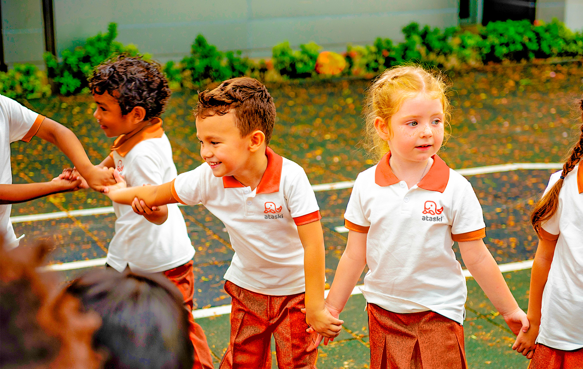
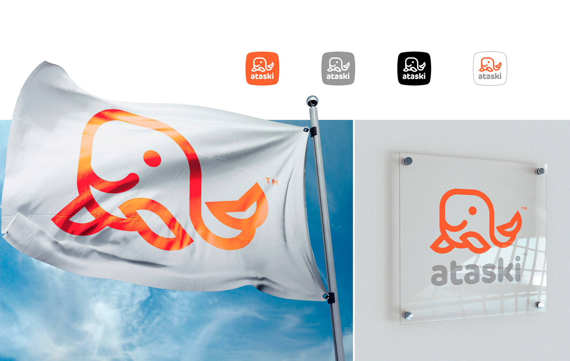
Under the proficient direction of Romero Melo, our graphic design maestro, we conceptualized the ‘Ataski’ logo. The design features a playful and easily recognizable octopus character, which symbolizes adaptability, intelligence, and multitasking – all the qualities that modern education aspires to imbue in its students. The choice of vibrant yet comforting colors reflects the dynamic and nurturing environment of the school. We further extended this visual identity across various applications, ensuring the brand’s consistency, whether it’s on a flag, school uniform, mobile application, or physical signage.
Result:
The client was ecstatic with the result. The logo has been positively received by both students and parents, with many remarking about its unique and playful nature. Its versatility across different platforms has ensured a cohesive brand presence, strengthening the school’s position in the educational landscape.
Client: German Kids School
Design & Art Direction: Romero Melo


