JustBang
Based on the provided designs for Justbang:
Objective:
Introduce Justbang, a fresh entrant in the dating app arena, with a distinctive visual identity that separates them from other platforms, particularly emphasizing their focus on non-committal relationships.
Challenge:
In the cluttered space of dating apps, standing out is essential. How do we convey the idea of spontaneous, fleeting moments while maintaining a professional demeanor to attract a mature audience?
Solution:
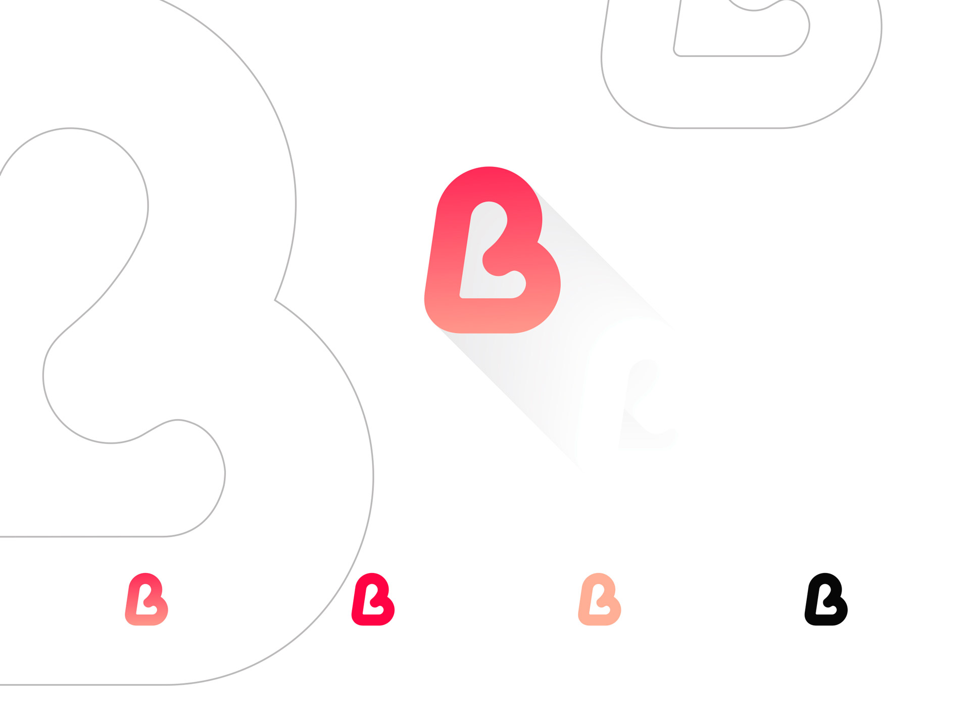
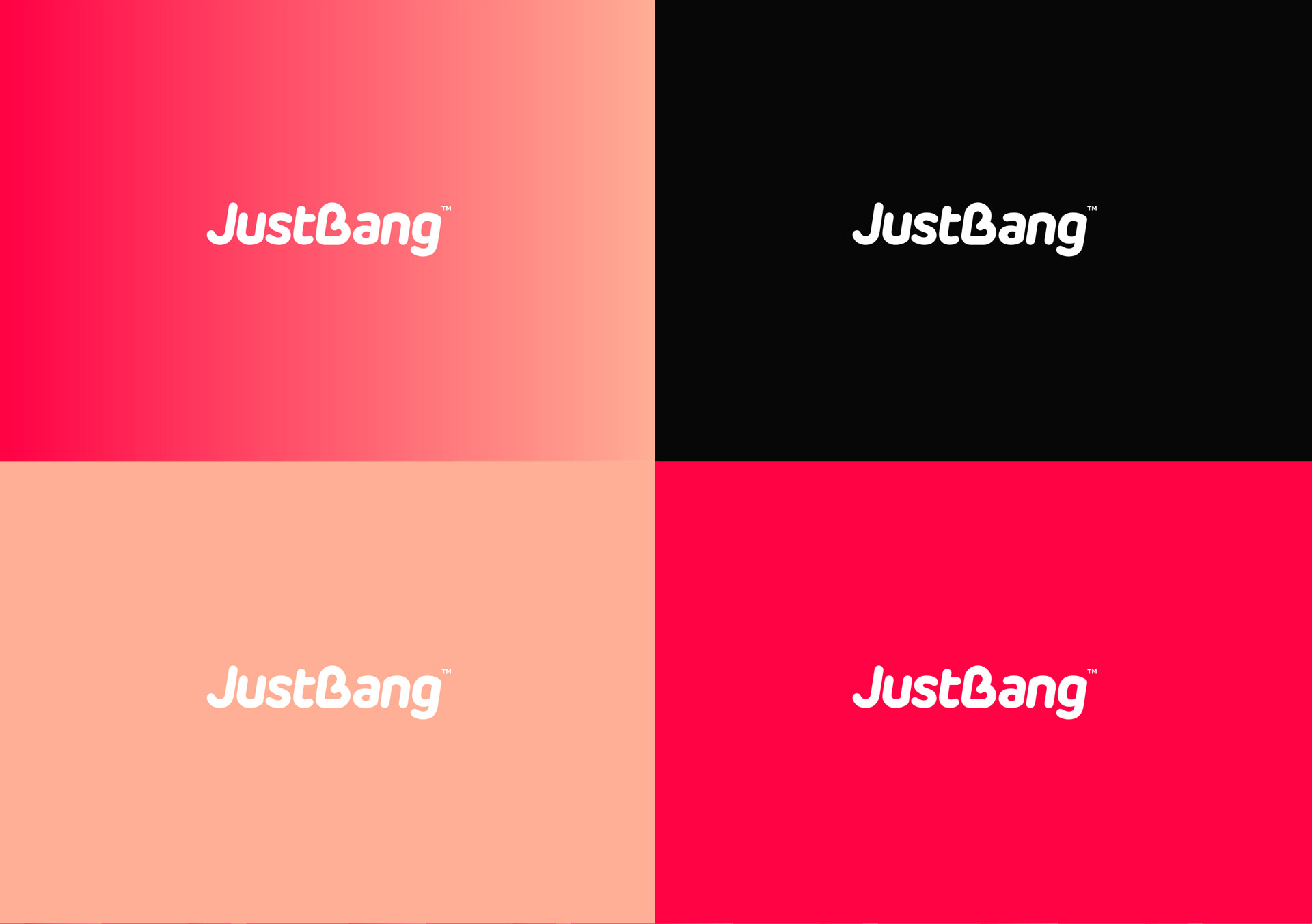
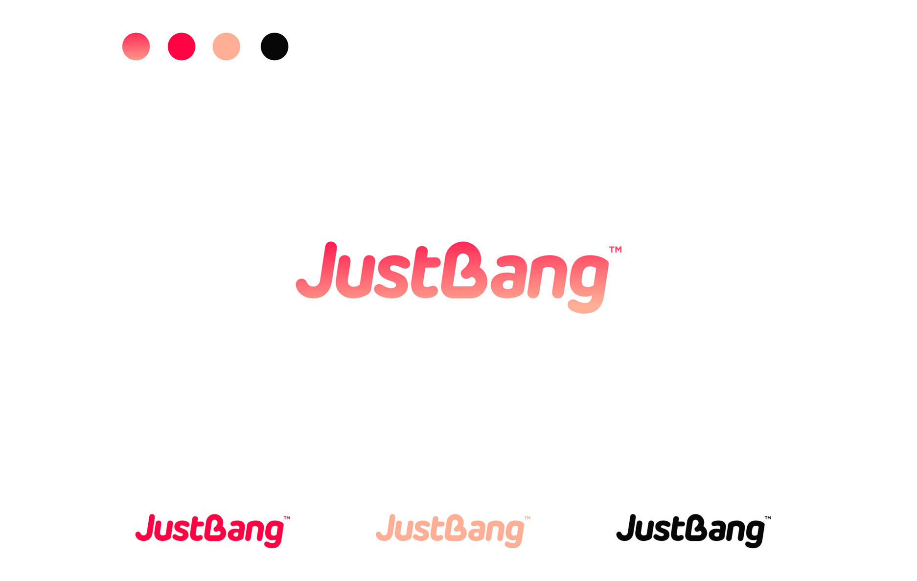
The heart-shaped “B” icon in the logo subtly intertwines the ideas of love and the brand’s initial, creating an easily recognizable and memorable symbol. The gradient color scheme from a vivacious red to a softer pink captures the progression of emotions, echoing the nature of relationships on the platform – passionate yet transient. The sleek, minimalist typography for “JustBang” adds a touch of modernity, assuring users of a contemporary, user-friendly experience. The color palette, with variations of reds and a contrasting black, gives flexibility for branding across different mediums, ensuring consistency and recognition.
Result:
The final designs provided a cohesive visual identity for Justbang. The intuitive symbolism of the logo, paired with the contemporary typography and color palette, resonates with the brand’s ethos and its target demographic, ensuring a memorable first impression as they venture into the competitive world of dating apps.
Designed with Dedication,
Romero Melo
Graphic Designer/Director of Art.
https://justbang.com/
