NOT YOUR MAMA’S MAMA
Project Overview
Client: Not Your Mama’s Mama
Location: United States
Industry: Entertainment / Television
Creative Direction: Romero Melo
Objective:
The vision for “Not Your Mama’s Mama” was to establish a bold and memorable logo identity for an upcoming American TV show that breaks the traditional mold of family-oriented programming. The show aimed to present a fresh, edgy, and modern take on the role of motherhood, with a twist of humor and rebellion. Our task was to create a visual symbol that encapsulates this spirit and resonates with a contemporary audience.
Challenge:
The challenge was to strike the perfect balance between classic Americana and modern rebellion. The logo needed to defy stereotypes and stand out in the highly competitive landscape of TV entertainment. It was crucial that the identity be versatile enough for cross-platform use while also capturing the show’s unique blend of sassiness, sophistication, and humor.
Solution:
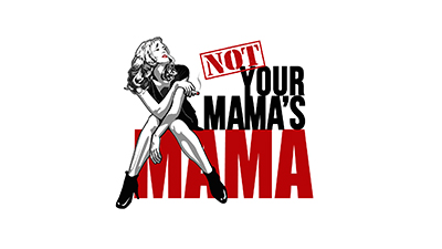
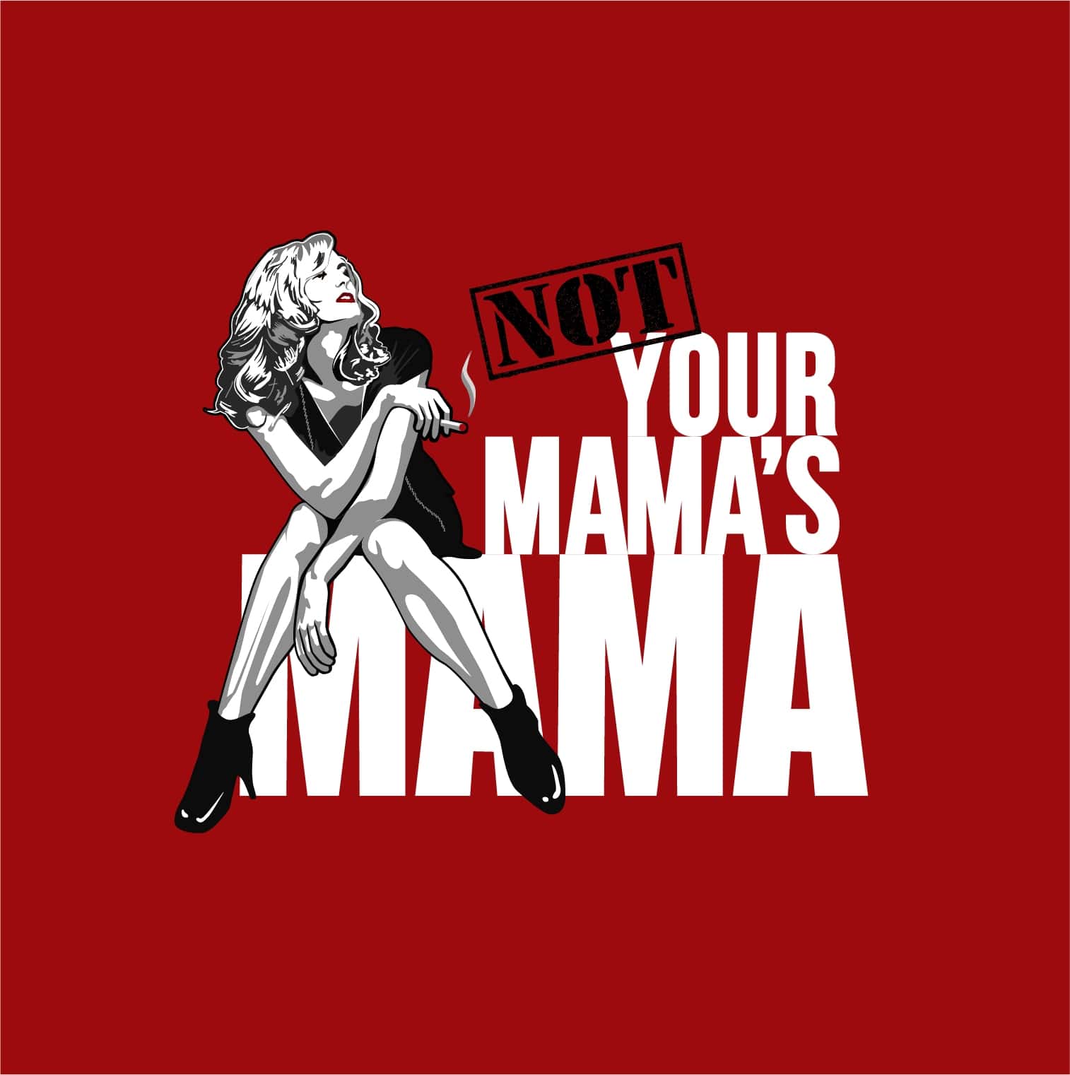
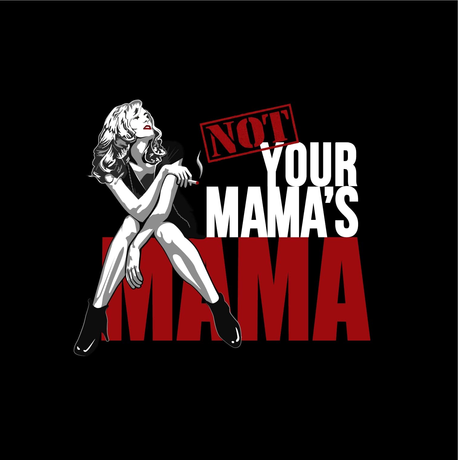
To encapsulate the show’s ethos, we designed an iconoclastic image of a modern ‘mama’ figure—a blend of vintage pin-up aesthetics with a modern twist. The figure’s dynamic pose and expressive style exude confidence and a cheeky sense of empowerment. Bold, impactful typography complements the illustration, with “NOT YOUR MAMA’S” set in a strikingly sharp font that cuts across the ‘MAMA’ logotype, suggesting a break from tradition and an unconventional narrative.
The color palette was deliberately limited to black, white, and red, a choice that invokes a classic feel while the stark contrast provides a modern edge. The red accents are not only eye-catching but also convey a sense of passion and energy that the TV show embodies.
Result:
The “Not Your Mama’s Mama” logo has been exceptionally well-received. Its distinct style has garnered attention and created a buzz, setting the stage for the show’s launch. The identity effectively communicates the essence of the program, and the branding has proven to be adaptable across various promotional materials, from online platforms to print and merchandise. This has set a solid foundation for the show’s marketing campaign and has sparked interest and anticipation among potential viewers.
In the landscape of TV entertainment, where first impressions are crucial, the “Not Your Mama’s Mama” logo stands out, promising an unconventional, bold, and engaging viewing experience. This identity not only meets the initial brief but surpasses expectations by providing a versatile and iconic brand image that the show can carry into its bright future.


